

Healthcare web design that fills your books
Traffic is not the goal - booked appointments are. Here is how conversion-focused healthcare web design turns clinic site visitors into patients who actually book.
Fady Ilias
Director, Web Divine

Most clinic websites are judged on the wrong thing. Owners ask whether the site "looks professional" when the real question is far simpler: is it filling the appointment book?
A beautiful website that generates no bookings is an expensive brochure. A well-designed one is your busiest receptionist - working every evening and weekend, quietly turning searches into confirmed appointments. The difference between the two is rarely aesthetics. It is design built around one job: converting a visitor into a booked patient.
Here is how the sites that actually fill books do it.
Make your services instantly clear
When someone lands on your site, they are asking three questions in the first few seconds: Do you treat what I need? Are you near me? Can I get in soon? If the answers are not obvious, they hit back and try the next clinic.
Clarity beats cleverness every time:
- Name your services in plain language - "knee and hip pain", not "musculoskeletal rehabilitation solutions".
- Lead with who you help, so the right patient recognises themselves immediately.
- Skip the jargon and the clever taglines - a confused visitor never converts.
The clinics that win are not the ones with the most poetic homepage. They are the ones a patient understands in five seconds.
Remove every obstacle between "interested" and "booked"
Every extra click, every "call us during business hours", every buried phone number is a place where a patient gives up. Conversion is largely a game of removing friction.
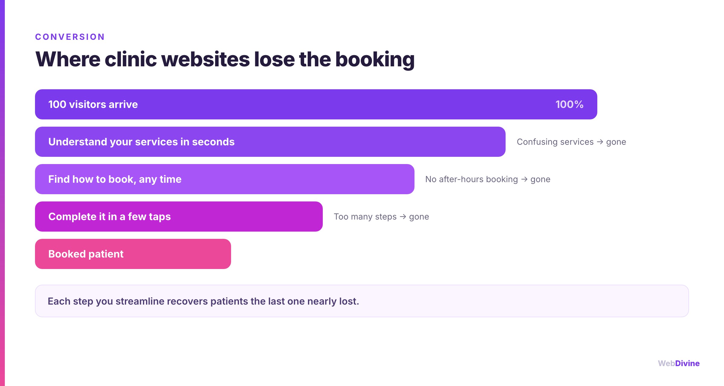
The essentials:
- A "Book now" button that follows the patient - in the header, on every page, impossible to miss.
- Online booking that actually works, integrated with the system your front desk already uses.
- Click-to-call on mobile, because a large share of your visitors are on a phone and ready to act now.
- A short path to confirmation - the fewer steps, the more bookings survive.
This matters most out of hours. A patient searching at 9pm cannot ring your reception - but they can book online in thirty seconds if you let them. We built precisely this kind of always-open booking flow for allied-health practices like Step Relief Podiatry, where the appointment is only ever a tap away.
Answer "where and when" without making them hunt
Healthcare is local and time-sensitive. A patient in pain wants to know they can get to you and get seen. If your location and hours are hidden three clicks deep, you are adding doubt at the worst possible moment.
Put the practical details front and centre:
- Address, map and parking or public-transport notes.
- Opening hours - including whether you offer early, late or weekend slots.
- Which services are available at which location, if you have more than one.
- Accessibility information, so patients with mobility needs know what to expect.
None of this is glamorous. All of it removes hesitation - and removing hesitation is what fills a calendar.
Reassure before you ask them to commit
Choosing a health provider is a trust decision, and patients look for reassurance before they book. Because reviews about clinical services sit under Australia's health-advertising rules, the strongest reassurance usually comes from other signals - which happens to make for a calmer, more credible site anyway.
What genuinely reassures a patient:
- Real photos of your practice, team and space - warmth and professionalism, not stock imagery.
- Practitioner profiles with genuine qualifications and a human face.
- Clear, factual descriptions of what an appointment involves, so there are no surprises.
- A calm, considered design that signals a practice that cares about detail.
Reassurance is what converts the anxious first-time patient - the one weighing you up against two other clinics in the same tab. Our work with practices such as Movement Medic Physiotherapy leans on exactly this quiet credibility.
Be fast, or lose them before you start
Speed is not a technical footnote - it is a conversion feature. If your pages take several seconds to load, a meaningful share of patients leave before they ever see your booking button. On mobile, where many healthcare searches happen, the penalty is even harsher.
Fast sites convert better and rank better. Search engines factor loading speed into where you appear, so a slow site loses you twice: fewer visitors, and fewer of those visitors converting. A properly engineered site - not a bloated template stuffed with plugins - keeps both problems away.
Get found by the patients already searching
The best-converting website in the world does nothing if nobody local finds it. Most clinics grow on local search: the patients typing "physio near me", "GP in \[suburb\]", "dentist open Saturday".
To capture that intent:
- Structure pages around real services and locations, so you match how patients actually search.
- Keep your practice details consistent across your site and directories.
- Maintain a strong Google Business Profile, which often decides who gets the click.
- Earn genuine local relevance rather than chasing tricks that age badly.
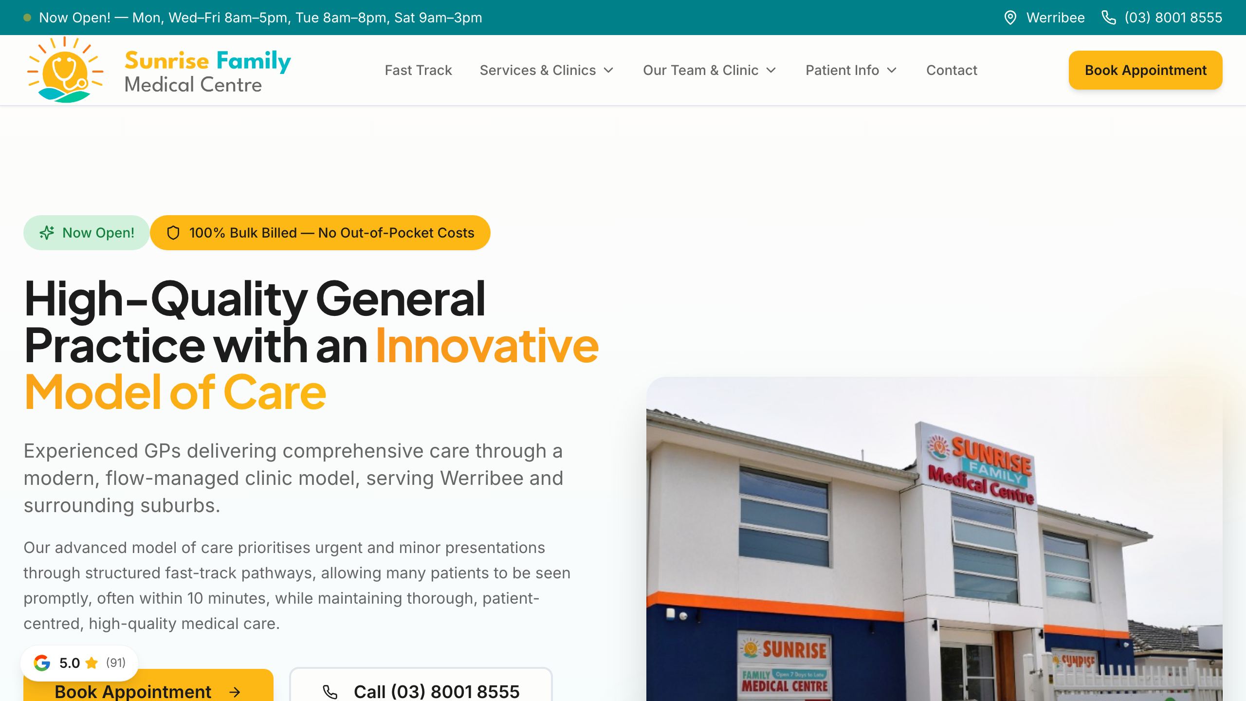
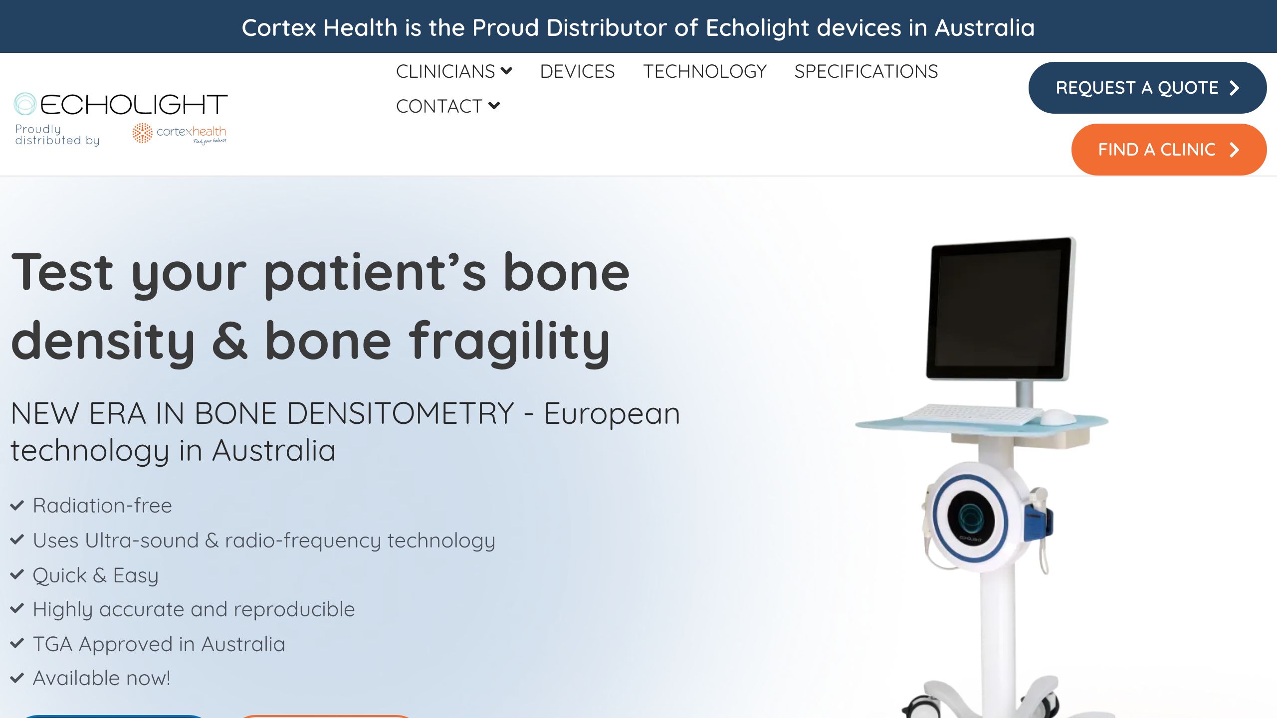
Get this right and you are not fighting for attention - you are simply present at the moment a nearby patient decides to book. Multi-location practices like Stud Road Medical Centre show how a well-structured site turns local searches into filled appointments.
It all compounds
Clear services, frictionless booking, obvious location and hours, genuine reassurance, real speed and local visibility - none of these is a silver bullet on its own. Together, they compound. Each one recovers patients the last step nearly lost, and a site that gets all of them right converts far better than the sum of its parts.
Your website's job is not to look impressive. It is to fill your book - quietly, every day, while you get on with treating patients.
Keep reading: before you optimise for bookings, make sure the fundamentals are covered - see website requirements for Australian medical & allied-health practices.
At Web Divine we design conversion-focused healthcare websites and premium web design and development for Melbourne clinics and practices, with senior people on every project and no junior hand-offs. If your site is getting visitors but not enough bookings, let's talk - we will show you where patients are dropping off and what it would take to turn that around.
Written by
Fady Ilias
Director, Web Divine
Fady Ilias is the director of Web Divine, a senior-led web design and development studio in Melbourne. He works hands-on with Australian businesses on conversion-focused websites, Shopify stores and custom web apps - senior people on every project, no junior hand-offs.
More about Web DivineKeep reading
More insights

Why is my website not converting? How to find the real problem and fix it
Getting visitors but not enquiries? The fix depends on the cause. Here is how to tell whether it is the traffic, the offer, trust, friction, speed or broken tracking, with a checklist you can run on your own site this week.

Website requirements for Australian medical & allied-health practices
A practical checklist for clinic owners and practice managers - what a compliant, patient-first healthcare website actually needs, from AHPRA-aware content to accessibility and online bookings.

WordPress security updates, September 2026: what to do now
Two WordPress security releases in six days, plus an Elementor Pro flaw hit by close to 190,000 attacks in five days. What changed, and what to do today.



Let's talk about your project
Book a call with the people who would actually build it. You'll get straight answers on scope and timeline, and a fixed quote once the project is scoped.